
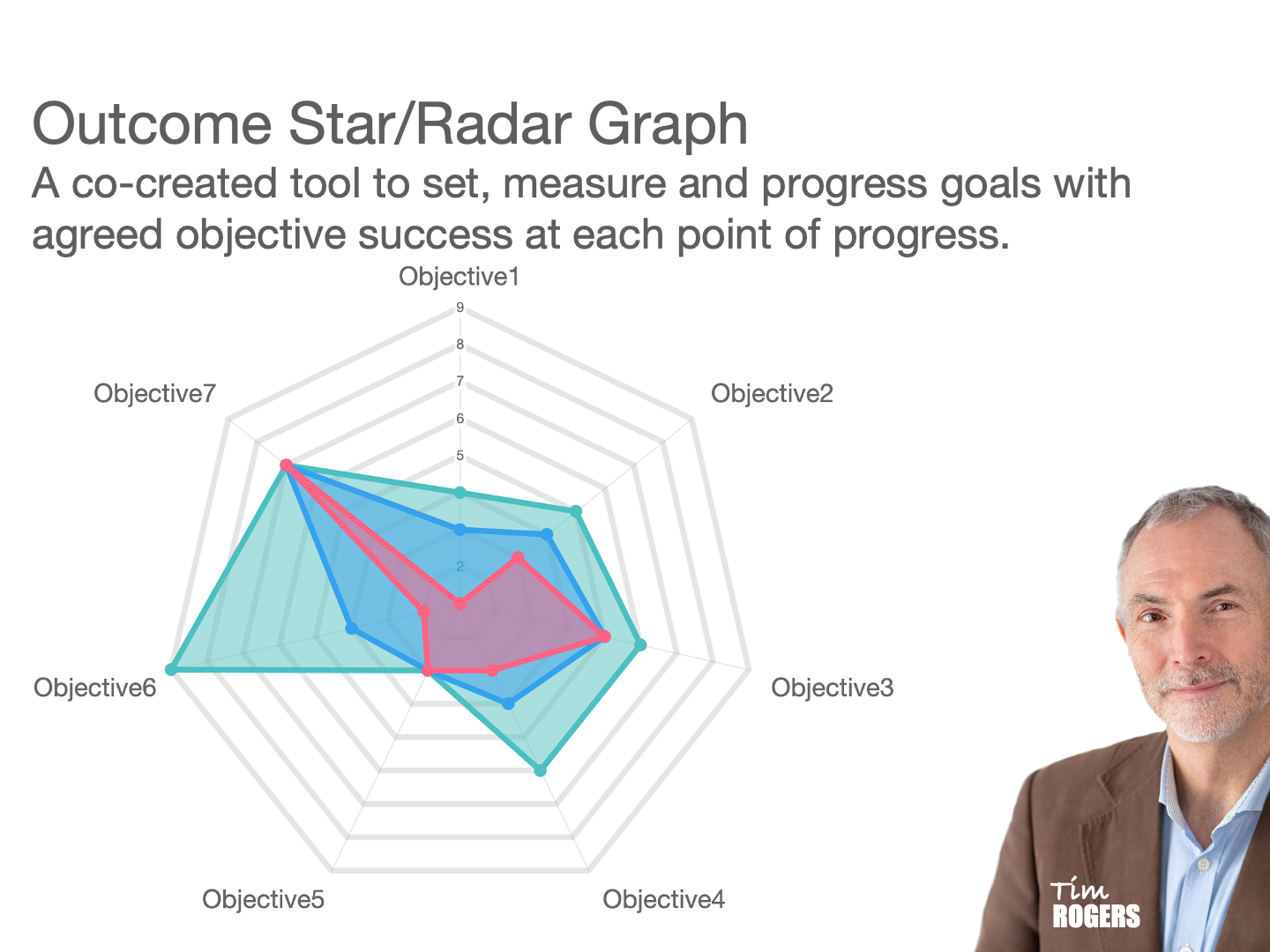
To explain the Outcome Star, which can also be visualized as a radar graph (or spider chart), you can break it down into a clear, structured process with key steps and concepts.
1. Visualizing the Outcome Star:
Think of the Outcome Star as a wheel with spokes (or a pizza cut into slices). Each spoke represents a different aspect or domain of someone’s life, progress, or goals that you’re measuring or tracking.
These spokes correspond to important areas, such as health, relationships, skills, or mental well-being, depending on the context (e.g., personal development, therapy, education).
2. Defining the Areas to Measure:
First, list the key domains (spokes/slices) that are important for the individual’s progress or the goals you’re working toward. For example:
Health
Employment
Relationships
Housing
Emotional well-being
Financial independence
These domains are individualized and can vary based on the context you’re using (e.g., therapeutic interventions, coaching, or support programs).
3. Agreeing on a Score System:
Together, agree on a scoring system to evaluate progress in each area. A simple system could involve 3 levels of performance:
1–3 (Poor): Needs significant improvement.
4–6 (Good): Satisfactory, but still room for growth.
7–9 (Excellent): Achieving or exceeding the desired outcome.
The scoring system moves from 1 at the center (poor) to 9 at the outer edge (excellent). This creates a visual representation of where the person currently stands in each domain.
4. Scoring Current State vs. Target Goal:
Current Score: Start by marking the current score on each spoke to show where the person feels they are right now. This score is based on a discussion or self-assessment about each domain.
Target Goal: Then, mark the desired score or target for each spoke, representing where the person wants to be. This helps set clear, measurable goals for progress.
Once the scores are plotted, you can draw lines connecting each score, forming a radar shape. This visual map helps highlight areas that need attention and areas of strength.
5. Exploring Ways to Achieve Goals:
After the scores are set, you can work together to identify steps and strategies to move from the current score to the target goal.
Action planning: Discuss specific actions or interventions needed for improvement. For example, if “employment” is rated a 3, explore ways to improve skills or access job opportunities.
Support systems: Identify what support, resources, or coaching is needed in each domain.
Milestones: Break down larger goals into smaller, manageable milestones to track progress over time.
The star can be revisited regularly to re-score progress, making it a dynamic tool that reflects ongoing growth.
6. Benefits of Using the Outcome Star/Radar Graph:
Clarity: It provides a clear visual overview of strengths and areas for improvement.
Goal-setting: The system encourages specific, measurable goals in each domain.
Motivation: The visual progress helps keep motivation high, as individuals can see how far they’ve come and what remains to be achieved.
Collaboration: It fosters a collaborative approach, as the individual plays an active role in scoring and setting their goals.
Example:
If you’re working with someone on personal development, the Outcome Star might have the following spokes:
Emotional well-being: Current score: 5, Goal: 8
Employment: Current score: 3, Goal: 7
Physical health: Current score: 6, Goal: 9
Housing stability: Current score: 7, Goal: 8
As these are assessed and updated regularly, you track progress visually and discuss strategies for continued growth in each area.
By consistently referring to this radar graph approach, it becomes a versatile, adaptive tool for goal-setting and performance measurement across various contexts.